A member sent us this request: someone asks a question, someone else adds two or three sentences, and in the end nobody knows which answer belongs to which question. On top of that, the chat window on mobile phones was too narrow. We’ve tackled both issues.
New: Replying with a quote
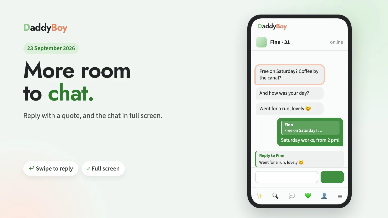
You can now reply to a specific message. On your mobile, simply swipe it to the right; on your computer, click the small arrow ↩︎ that appears next to the message when you hover over it with your mouse.
The text you’re replying to will then appear above the text box. Press ✕ or the Esc key to cancel. Your reply will show the original message as a small quote at the top; this works with text, images, voice messages and reactions. If you tap the quote, the chat jumps to the original message and briefly highlights it, even if it’s already near the top.
Your privacy remains unchanged: self-destructing images never appear as a preview in the quote, and if an image has expired, the quote simply says ‘Image no longer available’. If you’ve deleted your chat history, the deleted content won’t reappear in any quote either.
New: Full-screen chat
On mobiles and tablets, chats now open in full-screen mode. Only the logo remains at the top; your contact’s details are displayed on a single line, and you can use the small arrow ▾ to expand their location, match details and motto when you need them. The buttons for images, video calls and audio have been made smaller. The page no longer scrolls along with the chat – only the conversation itself scrolls, even if the radio is playing at the bottom.
If you want the familiar view, tap the button with the four corners in the top right-hand corner of the chat.
Improved: A tidier layout on your mobile
‘More’ in the bottom bar: Feed, News, Radio and Places used to be on their own line above the menu bar. Now they’re hidden behind ‘More’ in the bottom right-hand corner and slide up when tapped. This gives each page a bit more space.
The menu next to your name takes you directly to all the pages in My Account. Notifications, Status and Quick Hide are no longer duplicated there; you can access them via the icons next to them.
On mobile, the ‘Log out’ option was located below the menu bar and couldn’t be tapped. This has been fixed.
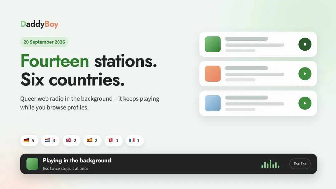
Radio: The bar at the bottom now displays the track currently playing on its own line below the station, so it fits even on narrow screens.
Thanks for pointing out the issue with the replies; it’s exactly this sort of feedback that helps make DaddyBoy better. If you notice anything or find something’s missing, the ‘Report a bug’ button is in the menu behind your name and at the very bottom of every page.